Hey Massage Therapists, how about some fun and useful information amidst all this license renewal info? We have been communicating with you about how important it is to renew your license (before midnight on August 31st. Don’t forget!!). Since you do so much to heal others physically & energetically, it could be easy for you to forget about yourself and your business environment.
The first thing clients notice when they come for a massage is the space they enter. The colors they are greeted with communicate & evoke different emotions on the subconscious level. What can you do to create a safe, cozy space for your client?
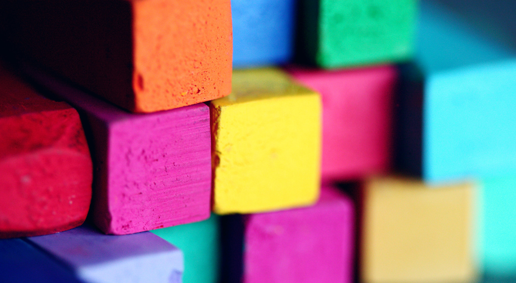
Utilizing specific colors in your massage room is a great place to start. Ancient cultures have used color as a healing method (called chromotherapy). For example, according to the Science of People, “we have a repository of information about a color. The color blue is almost always associated with blue skies, which when we are children is a positive thing — it means playing outside and fun. Evolutionarily it also means there are no storms to come. This is why it reminds us of stability and calm.” Read over the color guides (provided by Massage Therapy Works) below to help determine which color will set your desired mood.
- Red – is the most emotionally intense color. Red stimulates a faster heartbeat and breathing. In decorating, red is usually used as an accent.
- Pink – is the most romantic color and is often more tranquilizing. Sports teams sometimes paint the locker rooms used by opposing teams bright pink so their opponents will lose energy.
- Blue – is peaceful and relaxing. Blue causes the body to produce calming chemicals, so it is often used in bedrooms. People are more productive in blue rooms.
- Green – symbolizes nature & growth and is a calming, refreshing color. It is the easiest color in the eye and can improve vision. Hospitals often use green because it relaxes patients.
- Yellow – is a cheerful attention-getter. Yellow enhances concentration and also speeds up metabolism. While it is considered an optimistic color, people lose their tempers more often in yellow rooms, and babies will cry more. It is the most difficult color for the eye to take in, so it can be overpowering if overused.
- Purple – is the color of royalty, and it connotes luxury, wealth, and sophistication. It is also feminine and romantic. However, because it is rare in nature, purple can appear artificial.
- Brown – is a solid, reliable color and is abundant in nature. Brown can also be sad and wistful. Light brown implies genuineness, while dark brown is similar to wood or leather.
Now that you are more familiar with how to use color to create your healing space, see how you can use that knowledge to decorate with these tips from AtPeaceMedia.